Context
- It is about putting your numbers in context and comparing trends over time – periods.
Visualizing trends is an important activity. As the graph below shows, the Technorati Ranking is changing between the two blogs below over the summer months. While
- – blog.cytrap.eu drops during June it goes up again during late July/August (going up means worse rank with Technorati Ranking
– ComMetrics.com drops as well but seems to remain stable
What is the reason for both changes?
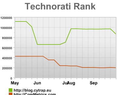
Without putting these statistics in context they might not reveal as much information as they otherwise will. For instance, while ComMetrics.com continued to post during all these months, in contrast, blog.CyTRAP.eu did not post much new material during June and July.
The result show that rankings dropped a few weeks later….
In short, context makes data a lot more interesting. By explaining why things happen it gets you to focus and helps you finding actionable insights.
So use the visuals My.ComMetrics.com generates for you to gain insights while keeping the context of the numbers reported in mind.
More about context
Of course, the two blogs mentioned above also serve different constituencies and deal with vastly different topics. One addresses issues pertaining to risk management and information security while the other focuses on social media). Accordingly, comparing these two blogs does not seem that fruitful considering that they address and cover different topics. Very likely, their readers differ as well, of course.
The more comparable the blogs are you want to compare, the easier it will be to make sense out of the findings. In turn, you need to make sure that your blog’s information is accurate such as the category you assigned it to. Otherwise, you might look at data that compare apples with oranges, not something that helps a lot.
For more information in this section see also: context, time periods, last update, dashboard