KISS dashboard
 Our dashboard (you are here)visualizes data generated by My.ComMetrics.com. It follows the principle of “information is in the eye of the beholder.”
It consolidates and arranges on your screen so you can monitor the information easily and quickly regarding the:
– Footprint and how big an impression your blog posts leave in cyberspace (with video).
– Health Check usability, trust and credibility of blog content (with video).
– Resonance such as, consistency, conversation and so forth (with video).
Related: web-based software, and SMART metrics
The dashboard of a car measures key metrics that are critical to making your journey safe, comfortable and getting you where you want to be in a timely fashion. However, different designers use radically divergent approaches to this issue.
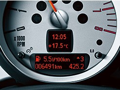 For instance, the Mini dashboard to the right gives you a lot of information. Time, speed and outside temperature are all neatly grouped as shown to the right. Beneath that, you see what your current fuel consumption is and a suggestion of what gear you should be in, among other things.
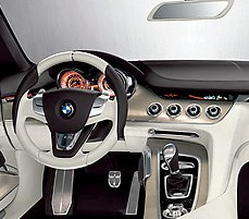 The BMW Concept CS to the left is another example of how far designers can go when trying to achieve superior comfort in the controls and displays. The new seat design houses elements of the car’s entertainment and communications features. In turn, this allows passengers to personalise things to improve comfort.
The approach for controls and displays in both the Mini and the BMW Concept CS seem to follow a minimalist mantra – or the Keep it Simple, Stupid (KISS) principle.
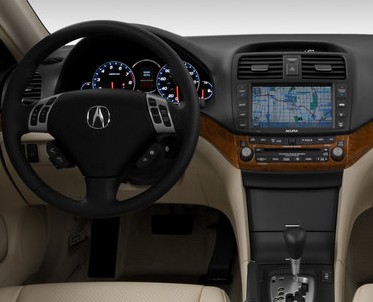 By contrast, the Acura to the right seems to use the opposite approach. Acura’s dashboard illustrates how all the same information can be presented through a wide variety of lights, toggles, gauges and metrics.
What does this mean for ComMetrics’ dashboard?
The car examples show that customer preferences result in vastly different car dashboard designs depending on the manufacturer. When designing ComMetrics, we tried to keep your preferences in mind, but we still followed the KISS principle. Therefore, no bells or whistles, but an ergonomically designed dashboard using a minimalist approach somewhere between the Mini and BMW examples above. Our goal is for you to be able to find the information you need quickly, without being distracted by too many buttons, toggles or gauges.
My.ComMetrics.com provides you with the ‘GPS’ to find out where you stand and where you are going in comparison to your competition. It suggests the best gear to optimize your speed and gas consumption. The dashboard supports your efforts to arrive at your destination on time and in style.What are you waiting for?
Get an account and start improving now!
For more information on how to interpret your data presented on the dashboard please have a look here:
dashboard explained – ComMetrics Blog Impact which is made up of:
- –
dashboard explained – ComMetrics Footprint
- – dashboard explained – ComMetrics Health Check
- – dashboard explained – ComMetrics Resonance Check
Pingback: SMART metrics with a BANG: 4 secrets » Key Performance Indicator, most important drivers, operating metrics, Prince William and Kate Middleton, protein shot, royal wedding, SMART metrics, social media ROI, T-Mobile, video goes viral, viral marketing » C