Time periods
- It is about putting your numbers in context and comparing trends over different time periods.
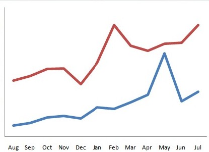
Visualizing trends is what we want to provide our users with regarding their own blogs as well as those they are tracking, of course.
If you want to know more about how we compare time periods, click here to find out. Important is to compare trends over different time periods.
Why would this be interesting?
Just try this: take a comparable time period, such as this year compared with last year.
All what historical trends can do is giving you some initial context.
Visualizing the trends between year 2 and 1 might be a good way to raise initial set of questions. For instance, you might ask yourself why does my ComMetrics Footprint peak differently in years 1 and 2 (i.e. different times of the year)? Should it not line up?
By the way:
This section benefitted from the great insights provided by Avinash Kaushik:
“Dear Avinash”: Be Awesome At Comparing KPI Trends Over Time
More about time periods
Time periods are an important factor when looking at rankings. For instance, during summer holiday season, traffic slows down. However, different countries have different periods when people go on summer vacation such as July or August. As well, for people in New Zealand or South Africa January and February are peak holiday months.
For more information in this section see also: context, last update, dashboard AND more on time periods
Pingback: SMART metrics with a BANG: 4 secrets » Key Performance Indicator, most important drivers, operating metrics, Prince William and Kate Middleton, protein shot, royal wedding, SMART metrics, social media ROI, T-Mobile, video goes viral, viral marketing » C